RunioAI came with a big ambition: make everyday services feel as easy as ordering a ride. The product was not trying to be another marketplace. It wanted to connect people with trusted local specialists through a smoother, faster, more reliable experience. The work was not just to make it look good. It was to make the brand make sense.
01 · Context
RunioAI is a two-sided platform serving both busy customers and independent service specialists. Customers want convenience, trust, and time back. Specialists want visibility, steady demand, and a fairer way to grow. The brand had to speak to both without feeling scattered.
02 · The Challenge
The market is already crowded with service marketplaces, directories, and on-demand platforms. If RunioAI led with “AI” alone, it would feel generic. The real opportunity was sharper: position RunioAI around effortless service and trusted partnerships, with AI working quietly in the background.
03 · Our Approach
We started with a live brand strategy sprint to define the foundation before touching the visual system. The process covered audience segmentation, positioning, competitive perception, brand values, personality, and the emotional promise behind the brand. The key shift was simple: RunioAI is not selling technology. It is selling less friction.
04 · The Thinking
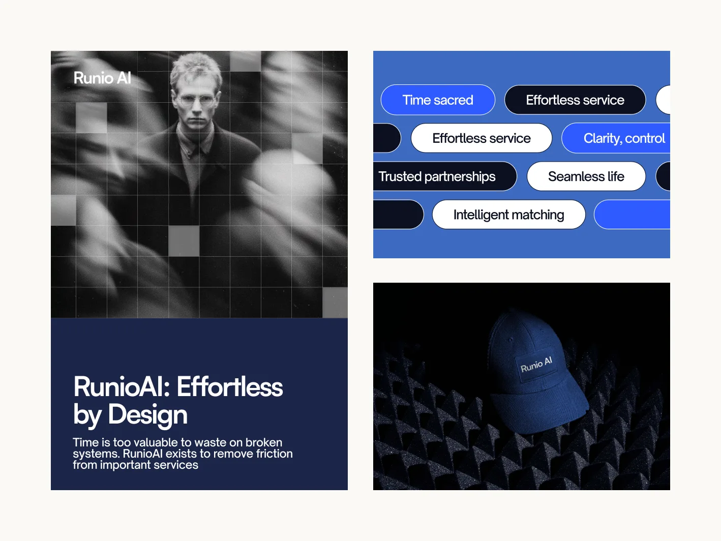
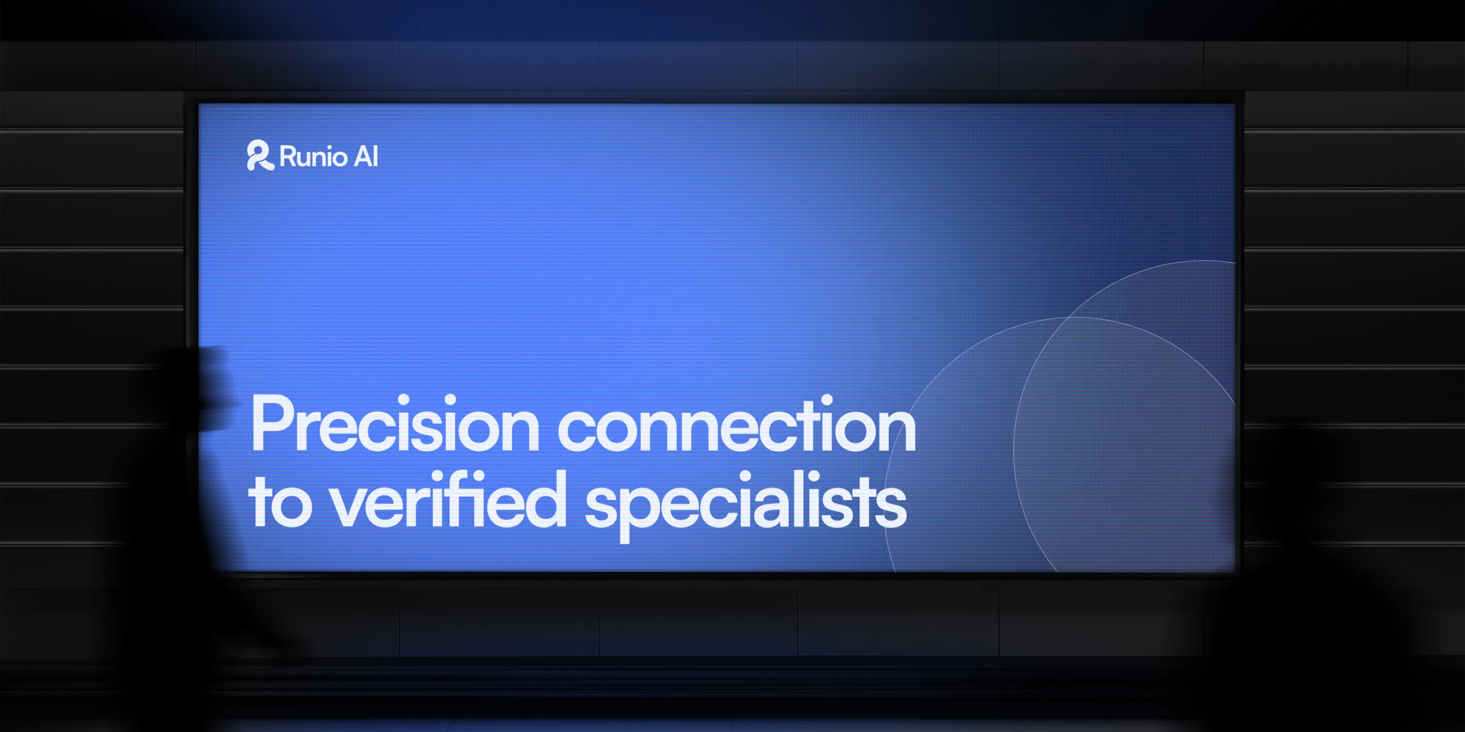
The brand system was built around one core idea: the Seamless Path. This came from the product promise and the logo's own geometry. The mark already suggested flow, connection, and movement, so we used that as the foundation for the wider visual language. Instead of random tech graphics, the system uses:
05 · The Work
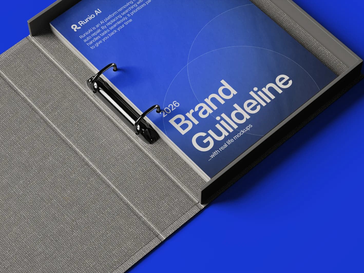
The full system gave the founder everything needed to present the company with confidence and stay consistent as it grows.
06 · Visual Direction
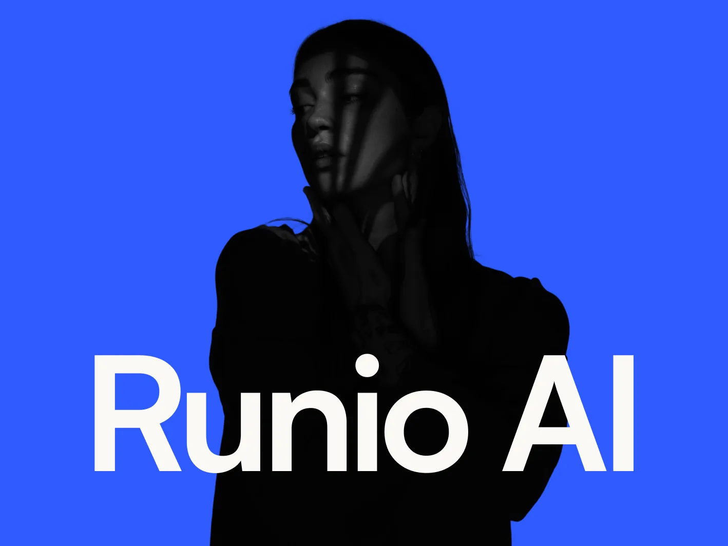
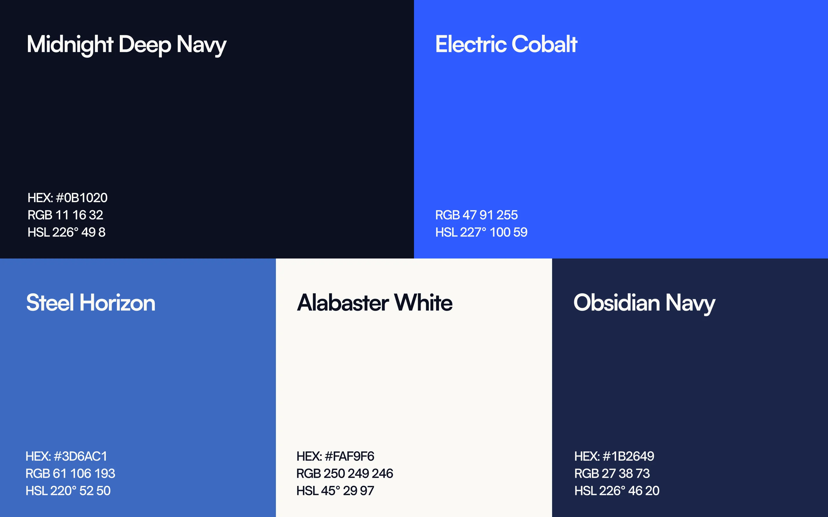
RunioAI needed to feel premium without feeling cold. The palette balanced a bold blue accent with off-white and deep ink tones. Typography stayed clean and readable. Photography direction focused on real people, real service moments, and natural environments. The identity avoids AI clichés, car clichés, and loud marketplace energy.
07 · Outcome
RunioAI now has a clear foundation for how it looks, sounds, and shows up. The brand can speak to customers and specialists with one consistent idea: services should feel effortless. The final system gives the founder the tools to present the company with more confidence, build assets faster, and maintain consistency across future touchpoints.
08 · Impact
“Honestly floored. USL made RunioAI feel like a real company before we'd even shipped. That doesn't happen.”
Seyi Ola
Founder, RunioAI
Next Project
Virgil Dev