Operating in East Texas and the DFW area across three arms (real estate development, private capital, and brokerage), the company had the work, the waiting list, and the conviction. What it did not have was a digital presence that reflected any of it. We were brought in to close that gap. Fourteen days later, the brand, the website, and the full operational infrastructure launched together.
01 · Starting with the Story
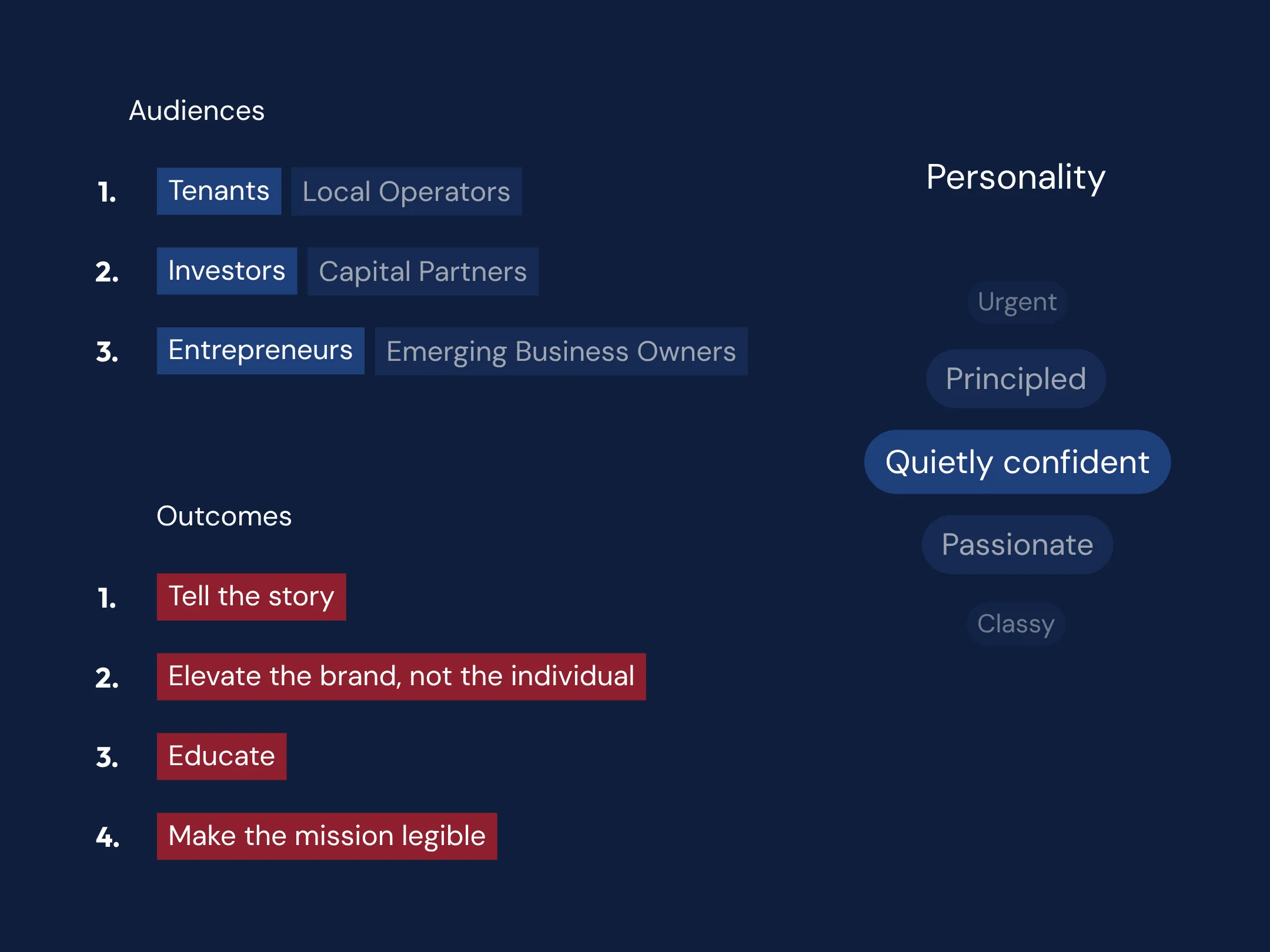
Before any call, we had an opportunity to understand the true goal of the project. It was less about conversion or lead generation. The Pony Rose story was about letting future investors, future partners, and future customers know what the organization is about. We collected this by working closely with the founder and capturing what he wanted in his own words. That raw material became the foundation for everything we built.
02 · Setting the Standard
The first real decision was how to frame the mission. Early drafts used “underinvested,” which describes a deficit done to a place rather than a belief held about it. We moved to “communities that deserve more,” and paired it with “overlooked” to describe the spaces, not the people. Every element that followed was tested against one question: does this read as conviction or charity?
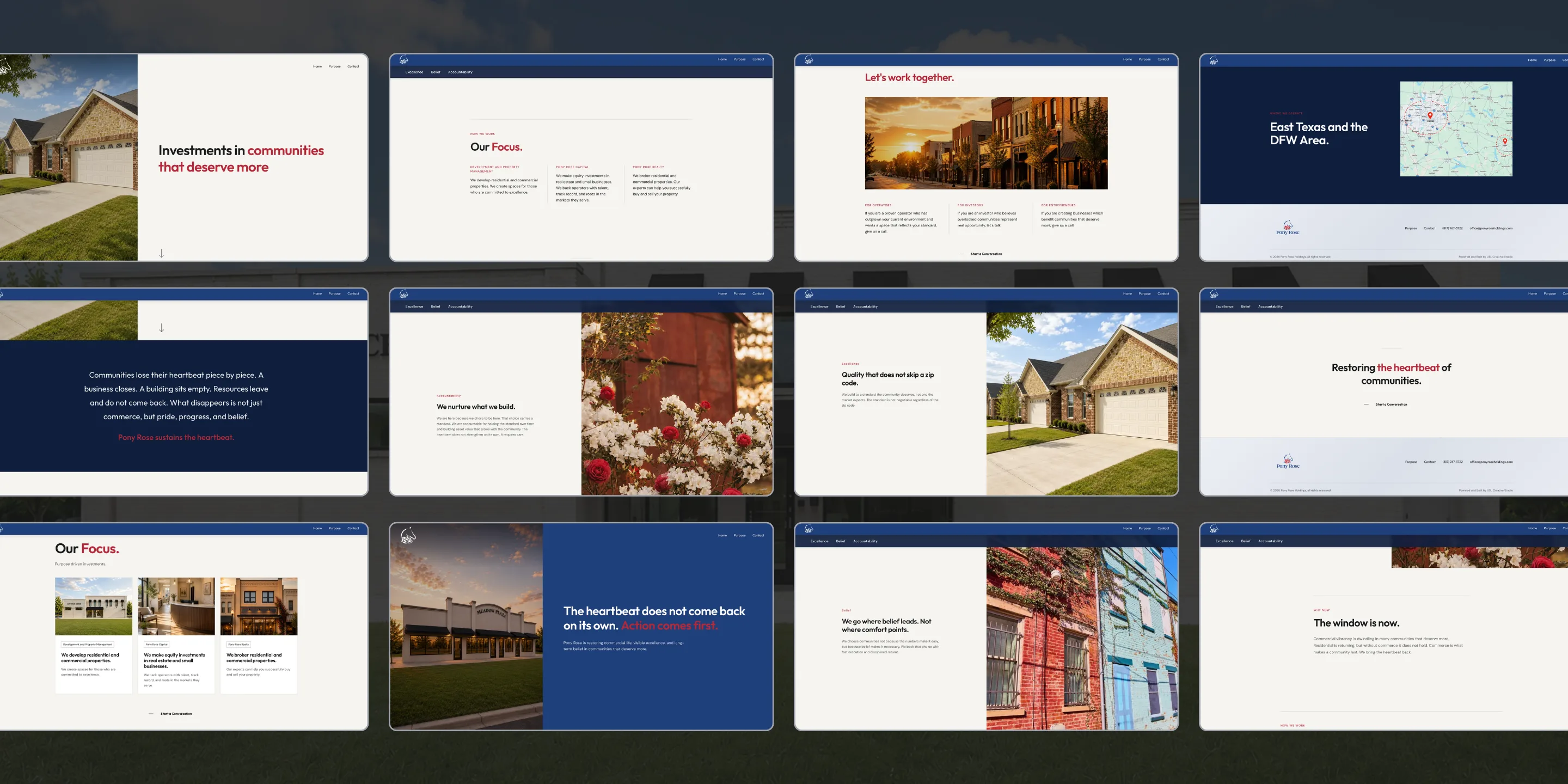
03 · One Story, Three Doors
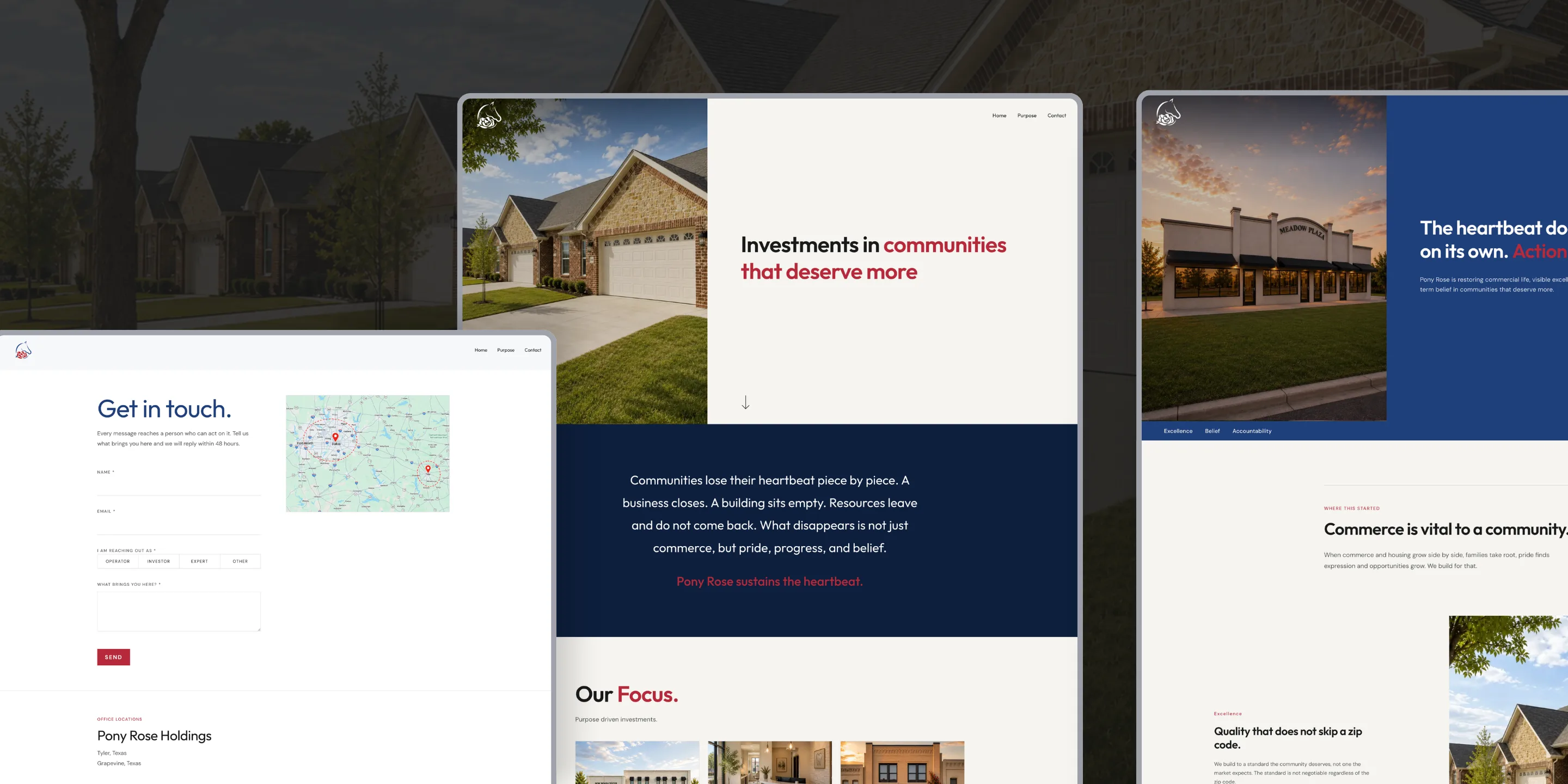
Three audiences and three business pillars could have produced six story threads across six pages. Most commercial real estate companies fragment that way and end up with six versions of the same brand competing for a reader's attention. We chose the opposite. The public site centers on three pages. Home carries the whole proposition. Purpose holds the belief behind the work. Contact is both the office and the doorway in.
04 · The Design
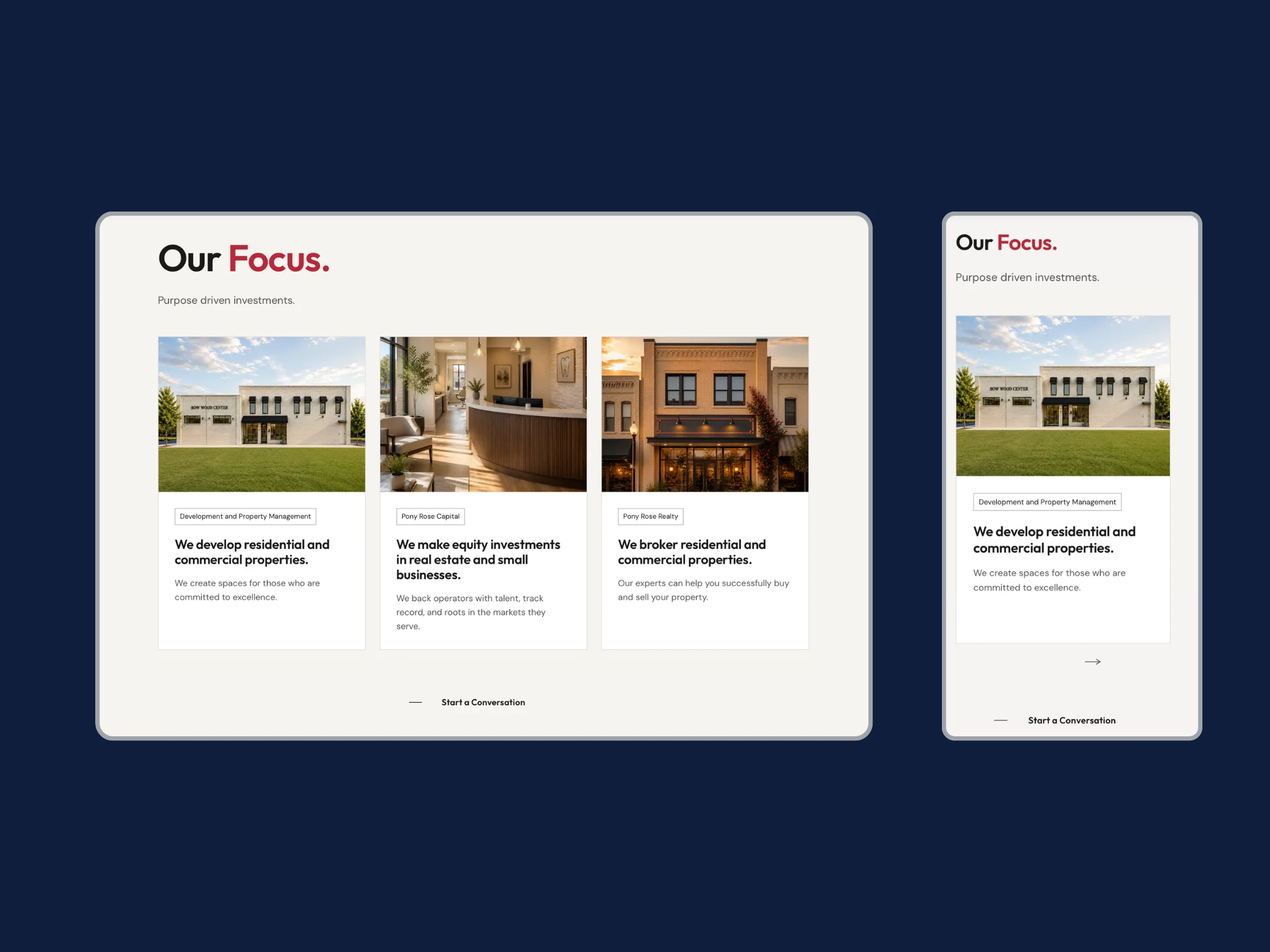
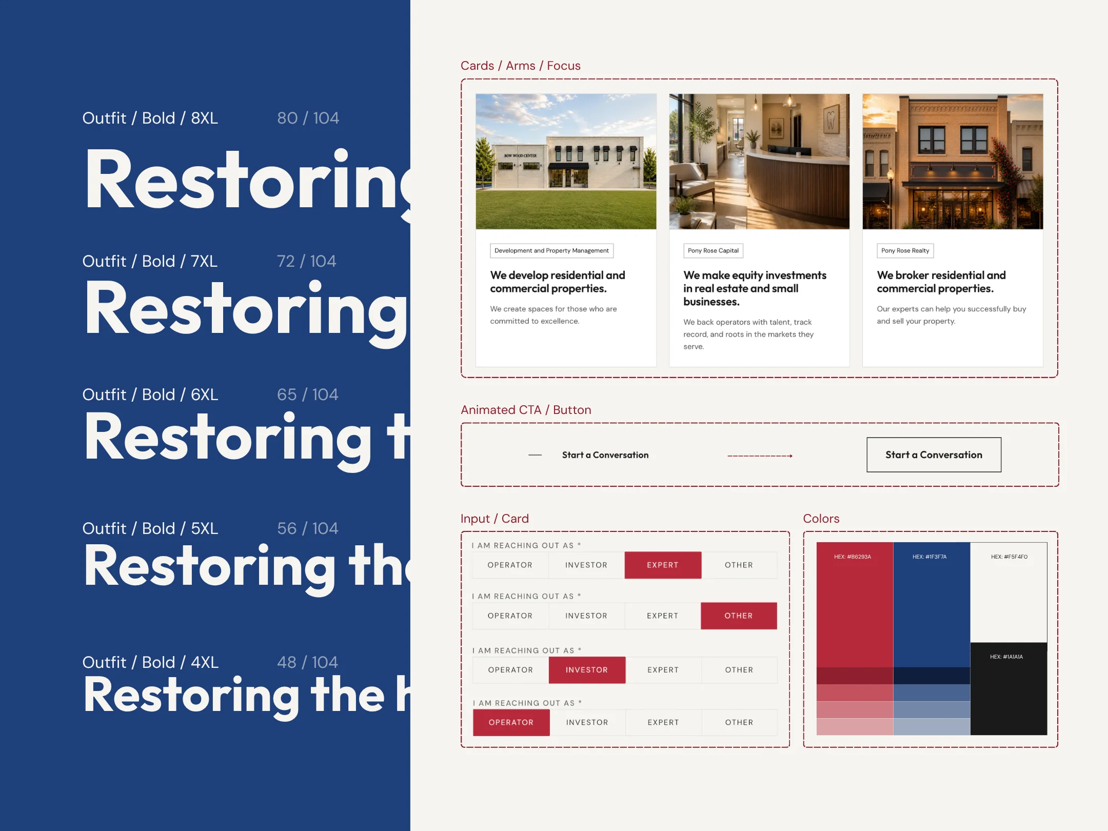
Color pulled directly from the client's logo files: a deep red and a confident blue on an off-white base with dark navy as the bookend. Typography runs on oversized headlines and generous body copy. Zero border radius, no drop shadows, no filler. Every hero image is a real Pony Rose property (Bow Wood Center, Meadow Plaza), and motion stays restrained so nothing on the site competes with the words.
05 · Built from Scratch
The visual language the site required (zero border radius, no drop shadows, oversized typography, deliberate whitespace) fights every default in mainstream component libraries. Building the ten components the site actually needs from scratch kept the page weight low, kept accessibility decisions in our hands, and let the brand land exactly as the design system specified.
06 · The Full Stack
Alongside the build, USL acquired and configured the domain, provisioned Microsoft 365 Business Standard for five users, and stood up the complete working environment: custom email addresses, a shared office mailbox, Teams, SharePoint, OneDrive, Loop, and 1Password for shared credential management. The security baseline was configured from the start: SPF, DKIM, and DMARC records, multi-factor authentication for every user, and conditional access policies across the board.
07 · Impact
Next Project
Exelita